Friday, 30 November 2018
Monday, 26 November 2018
Tuesday, 20 November 2018
Blog 3 - Practical Peer Review 2
Peer crit 19th November
-The right amount of visual
information is included in each illustration-visually stimulating
-Effective simplistic aesthetic
(trying to communicate the atmosphere and experience rather than exact and accurate replica)
-Synthesised practical and theoretical understanding. Exploring lots of mediums practically.
Next...?
-What will your final outcome be? A
book?
(A scrapbook, a collection of all my musical experiences together in one original book, holding aura)
(A scrapbook, a collection of all my musical experiences together in one original book, holding aura)
-Could you provide some writing alongside your images? This would give more of an insight to your experience?
(I have been creating case studies for each gig which so far are digital and therefore have not been shared, agreeably they are important)
FULL CASE STUDIES ARE ON GOOGLE SLIDES ON BLOGS.
-Is it important to know who the performers are and where they are?
(This is something I discuss in my essay and I personally find important as they create each musical experience)
-Maybe one image alone isn’t enough to capture the experience?
(Just a snapshot, that one image becomes the rejuvenation. Perhaps more images per event would collectively provide more aura? I have been focusing on the range of different experiences rather than unpicking a few gigs, this could be deemed good and bad I guess)
-How can you show movement and make the moment more alive?
-What are you specifically trying to capture in each image? Sound? Atmosphere? Experience?
(Each image has a different purpose depending on the musical experience and what jumped out at me being important and a main/memorable factor... this plays a big part in determining the medium used to create each image)
Sunday, 18 November 2018
Wednesday, 14 November 2018
Saturday, 10 November 2018
Monday, 5 November 2018
David Navas
David Navas
 |
| Really get a sense of the performer here. Music portrayed through colour behind the singer. Movement portrayed through loose line work, multiple sketchy lines Immediate (rough and sketchy), definitely could have been drawn standing at the front of the audience looking up. Compositionally the angle really captures looking up, impressed at the musician. Portrayed closeness through not being in fully (cut off) in the image |
 |
| This captures a sense of the performance. The orange glow portrays the sound filling the room Still image, showing focus and concentration on watching the musicians and feeling the music. Distance from the musician personally is shown through the view from his seat, also because the pianist is facing away. Powerful image due to the limited colour palette. The white of the pianist shows presence and how vital the musician is for this experience. |
 |
| This captures a laid back atmosphere, possibly a local band in a local bar. Looks like the band are quite new because there isn't a lot of movement or stage presence portrayed Don't really get a sense of the sound in this image, more about the location of the experience. This eye is drawn to the bright chandelier and bright fishes in the window... perhaps he was intrigued and distracted by these? |
 |
| This is a very atmospheric image, capturing the sense of the sound and music. The merky green is quite an odd choice of colour, perhaps it was quite an experimental jarring sound? The circles of colour represent the music the fills the sound. The performers are clearly portrayed in this image tonally through use of dark and sparse line work.Quite a loose and sketchy image which has been enhanced digitally to become more finished. |
Sunday, 4 November 2018
Jenny Soep
Jenny Soep


Movement is captured through the use of layering. The figures overlap
showing what is behind but you still know is there as you got a snap-shot of
it. It is also capture through the loose
use of line, the image is quite gestural, capturing the essence of the performance over the
detail.
You get a clear impression of the
genre of the music as well through the use of just black and red (colours associated with punk), the shape of the outfits and the body language and stances of the
performers.
Compositionally this image captures the whole of the band, the atmosphere of what could be seen on the
stage. It is uses a good balance of solid shapes and line work, being busy but
also having space.

This is quite an abstract impression of this ensemble. It gives no
details of who the performers are, effectively they are only silhouettes. The illusion of movement
is created through the blocks of colour not
being solid, having a loose and soft tonal
range to them, which gives the impression that they aren’t rigid and still.
The musicality is articulated through the use of white simple, minimal and loose lines on top of the shapes. This
brings alive the character of the
music, especially as it is the instruments and parts of the body that move with the music that are
drawn (eg. Clarinettists’ leg jigging, the violinist’s arm bowing). These
visual qualities capture the experience as well as that compositionally it is
from an angle without all of the members being completely visible.
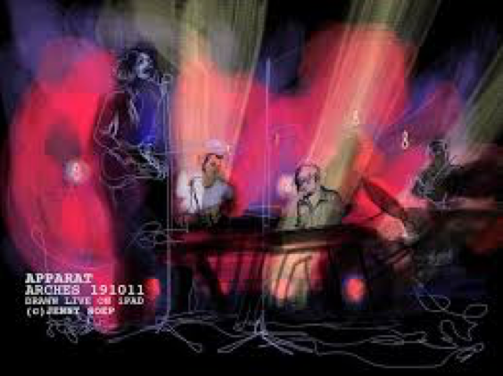
This image completely takes me there, to that experience. I
can imagine being there, looking at this performance and seeing the lights on
the stage. The array of colour,
centralised around the musicians, gives me the impression that it is more
than just lighting but it really allows me to see the music escaping the performers, filling the space with
sound. The spotlights bring out where the music at that moment is coming from
(keyboards) without defining the musicians
too much and therefore distracting from the music being experienced. It has a
wide range of tonal qualities,
adding limited light only when
deliberately accentuating something.

Immediately with this
image, I get the impression of improvisation.
The image is focused around one
guitarist in the foreground with almost electric
wiggles (soundwaves) coming out. I can imagine he is ripping up a funky blues solo on an electric
guitar. There is a very immersive spatial
atmosphere portrayed through the yellow sheen around the rest of the band
and the confetti shaped representation of sound
filling the composition. There are lots of line work used but in a gestural
and abstract way, interestingly all in colour of a purple and turquoise
colour palette which are ambiguous
colours interpreted differently by different people. You experience the excitability of the illustrator looking
at this image and possibly that her attention
was focused due to the use of a black background.

This is an extremely abstracted, simple image. It is almost
as if this image captures the audience of a live musical performance rather
than the performers. The rough line work
captures the element of movement. The lack
of detail captures the audience as an atmosphere
rather than individuals, which would almost be irrelevant to capture as they
are strangers. The variation in depth
of the line creates the flickering effect of where light lands and how much
detail could be seen, capturing the essence
of humans. The dense nature of the figures creates the impression that it
is at the front of the stage, near the barrier and that everyone is very eager
to watch because they are mostly facing forwards, without a lot of room.
Subscribe to:
Comments (Atom)